
 Shai Greenberg
In this post in the blog series on using Kibana to visualize data on COVID-19, we'll visualize the data using maps, while also learning scripting and data ingestion basics.
According to Wikipedia, The first attempt at map making dates back to a carving on a mammoth tusk from 25,000 BC. The first known attempt at a world map by the Babylonians dates back to 600 BC. Geospatial analysis dates back the 19th century, and the 1960s saw the development of computerized Geographical Information System.
Standing on the shoulders of millennia of human achievements, and using Elasticsearch and Kibana, we'll create a map of the world to show the spread of the novel Coronavirus. In the previous posts we've loaded the data and analyzed it using Discovery, some visualizations and a dashboard. Showing the data on a map will require some additional work, but don't worry, it's not a mammoth task.
If you haven't yet - make sure you follow the instructions in the first post on installing Elasticsearch and Kibana and loading the data before proceeding.
A Question of Geography
Open the maps application (in the Kibana menu on the left - as a reminder you have a button at the bottom to see the names of the various apps).
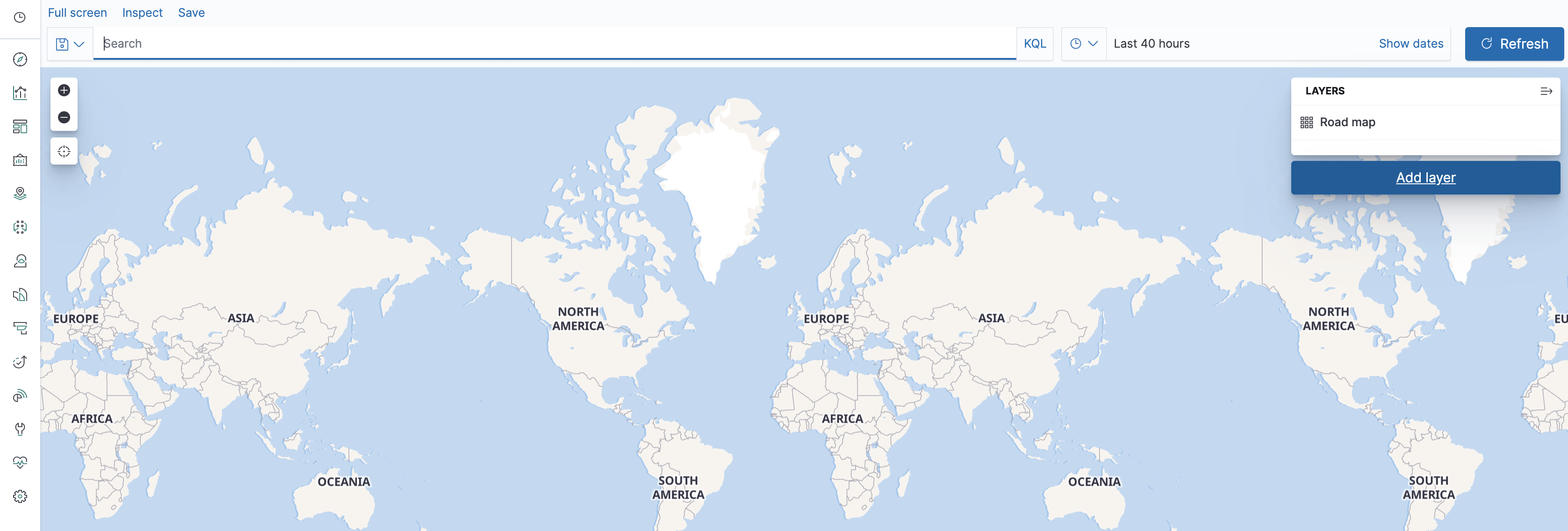
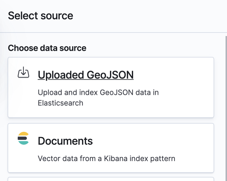
You can see a map of the world - now we just have to add data to it. Let's do that by adding a layer and choosing the Documents data source from Elasticsearch.
Choose the corona* pattern. In the geospatial field "Location" would automatically be chosen. This is not a field that came with the datasets, but rather one we've created based on the latitude and longitude fields when loading the data. If it doesn't appear go back to the first post and make sure you've done things correctly. If you haven't, you will need to delete the old indices. You can do that using Kibana under the management app in Index Management.
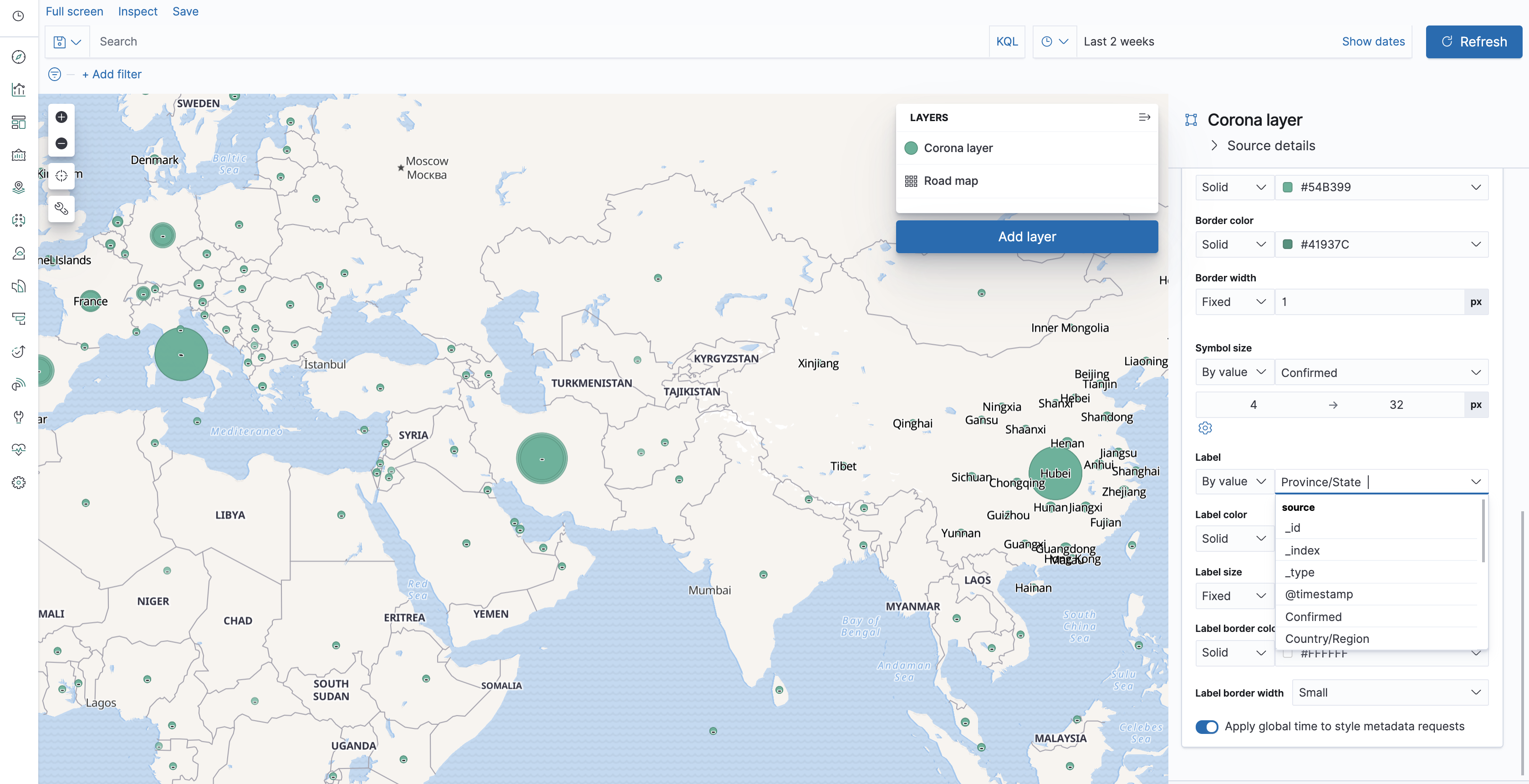
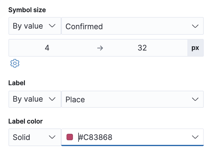
Once you can see the Location field in the maps app, click "Add layer". Set the time filter to show data from the period that had been loaded, and you'll now be able to see stats on the map. Unfortunately, they're not the right stats yet - and - as you may have guessed now that you've created some visualization already - they're the document counts. So let's change the layer settings to fix that. That's achievable by scrolling down in the layer settings, and changing the symbol size from Fixed to "By value", and choosing the "Confirmed" metric.
So now we can see some differences between the sizes of various dots on the map, but if you've followed the first two parts you're probably suspicious of those sizes - and with a good reason, always be suspicious of visualizations that come without numbers and texts attached to them! So let's first add some labels. Change the Label to use "By value" and then... uh-oh. We can use country to describe the data point, but then China would have all those data points which aren't detailed enough to understand which province they represent. Or we could use province/state and then the data points without province/state would have no label.
A Matter of the Right Script
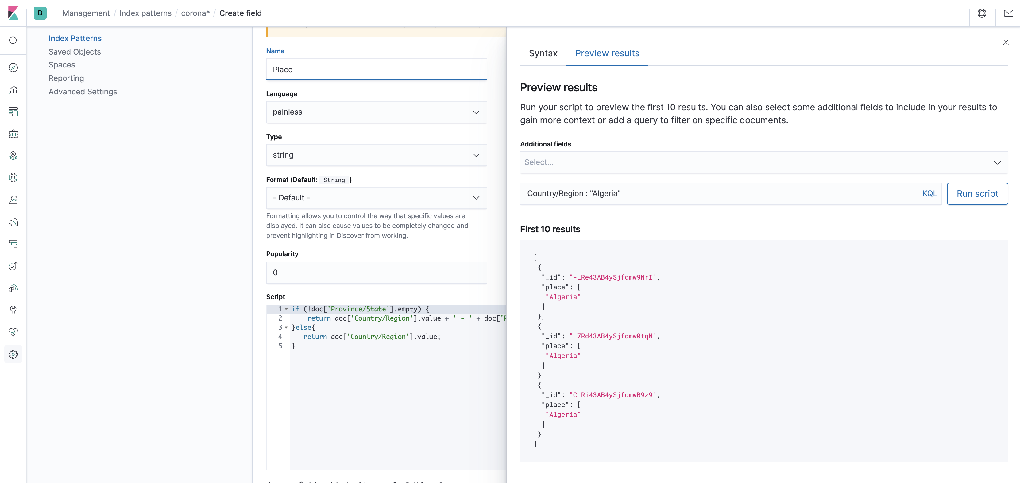
So optimally we would pre-bake a calculated field to solve such an issue during data ingestion, like we did with the Location field. But rather than having you go through deleting the indices again and loading the data, this time we'll add the field in the index pattern. This is done using a script, which means it's usually not recommended performance-wise, but sometimes we don't want to reload the dataset and are willing to pay the price of the on-the-fly calculation. So save the layer and then save the map, and then let's go into the index pattern to add the field. This is done using the Kibana management app under Index Patterns. Now go to the index pattern corona*, and choose the Scripted Fields tab. Add a scripted field, call it "Place", choose Painless as Language, and string as type, and then insert the following into the script box:
if (!doc['Province/State'].empty) {
    return doc['Country/Region'].value + ' - ' + doc['Province/State'].value;
} else {
    return doc['Country/Region'].value;
}
This creates a label that's either a concatenation of the country and the province, or just the country if the province doesn't exist. The annoying part about scripting is figuring out the right syntax. Fortunately you can check for correctness and preview the results by clicking the very cumbersome link "Get help with the syntax and preview the results of your script", and clicking on "Preview Results". You can test that the script actually does what it's supposed to do by adding the country and province fields to the preview. Make sure to test that your script works OK for different sets of the data, by filtering the preview in the filter above the preview window. Once you're done previewing, exit the preview window and save the field. With that ready, let's get back to our map, and edit the layer settings for the layer we've previously created.
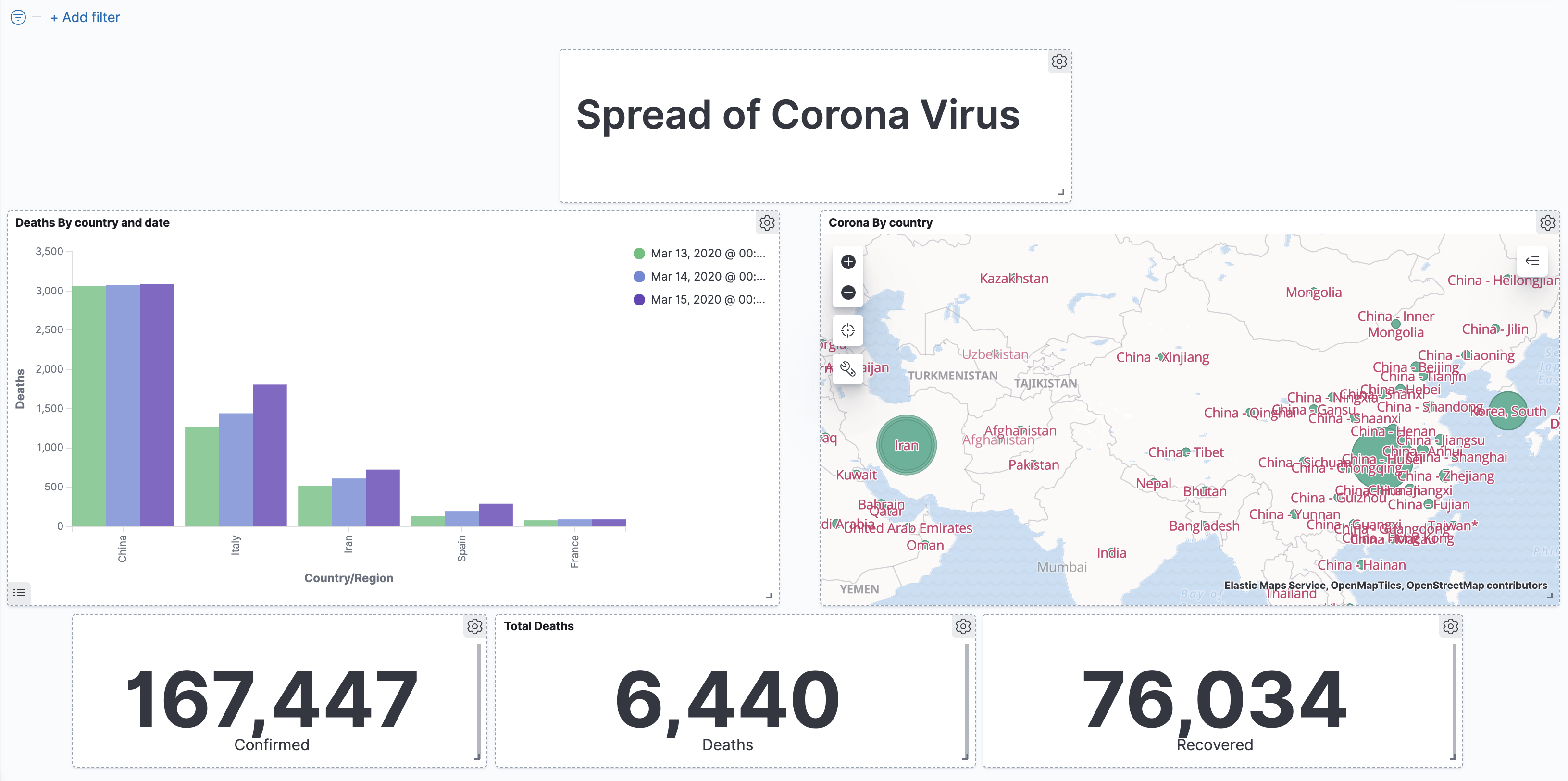
We can now choose "Place" as the label text. That seems to be fine, except maybe those labels are a bit similar visually to those that come attached with the built in layer. So let's color our labels, say in red. You can also decrease the opacity of the built in layer to make the current layer stand out more. Now that we have the labels down, we can deal with the numbers - add the Confirmed metric to the Tooltip fields in the layer settings.
Looking at the tooltips, we can see that the data actually corresponds to the latest data for each place, that is, the latest timestamp. That is not necessarily something we'd expect - if you recall, other visualizations summed up the data from all of the dates. You can affect which date is shown by using the time filter, or by changing the sorting in the layer settings. Since the user may be interested in learning more than the number of confirmed cases, we can also add the other metrics to the tooltip. Now all we have to do is add the map to the dashboard.
A Surprise Coming out of Left Field
Well, that was quick! As a bonus, we'll take a look at a region-based map, and do some simple ETL manipulations for compatibility.
The people at Johns Hopkins University Center for Systems Science and Engineering are working tirelessly to enrich the corona dataset. One of the nice things that they've added was is a FIPS code, which allows identifying the data record by US county. Fortunately Kibana has a built-in region map layer, and together they allow creating a highly-precise look at the state of corona information in different counties. Unfortunately, this meant a change in the schema of the data files for existing fields as well (starting with data from March 22nd) , which means the new files aren't compatible with the schema of existing index.
What we would want is for the new data coming in to be backwards-compatible with existing visualizations, while at the same time allowing us to use the new fields with new visualizations.
We'll tell Elasticsearch to copy the new fields into the old fields by using the "copy_to" parameter of the mapping (you could also do that with the "set" processor in the ingest pipeline - I'll leave that to you as an exercise).
So, let's go to the upload file screen in the Kibana Machine Learning application again. We'll load the 4.11.2020 file from the repository as the index corona-v2-2020-04-11. Make sure to create a new index pattern, and call it corona-v2* .
Index settings are as before:
{
  "number_of_shards": 1,
  "number_of_replicas": 0
}
The mapping now includes the new fields, with the copy_to parameters for the relevant fields:
{
  "@timestamp": {
    "type": "date"
  },
  "Active": {
    "type": "long"
  },
  "Admin2": {
    "type": "keyword"
  },
  "Combined_Key": {
    "type": "keyword"
  },
  "Confirmed": {
    "type": "long"
  },
  "Country_Region": {
    "type": "keyword",
    "copy_to": "Country/Region"
  },
  "Country/Region": {
    "type": "keyword"
  },
  "Deaths": {
    "type": "long"
  },
  "FIPS": {
    "type": "long"
  },
  "Last_Update": {
    "type": "date",
    "format": "yyyy-MM-dd HH:mm:ss"
  },
  "Lat": {
    "type": "double",
    "copy_to": "Latitude"
  },
  "Long_": {
    "type": "double",
    "copy_to": "Longitude"
  },
  "Latitude": {
    "type": "double"
  },
  "Longitude": {
    "type": "double"
  },
  "Location": {
    "type": "geo_point"
  },
  "Province/State": {
    "type": "keyword"
  },
  "Province_State": {
    "type": "keyword",
    "copy_to": "Province/State"
  },
  "Recovered": {
    "type": "long"
  }
}
As for the ingest pipeline, we'll have to modify the code for the location field based on the new fields:
{
  "processors": [
    {
      "set": {
        "field": "@timestamp",
        "value": "2020-04-11"
      }
    },
    {
      "set": {
        "field": "Location",
        "value": "{{Lat}}, {{Long_}}"
      }
    }
  ]
}
Now import the data, and... What's that? We're getting errors?
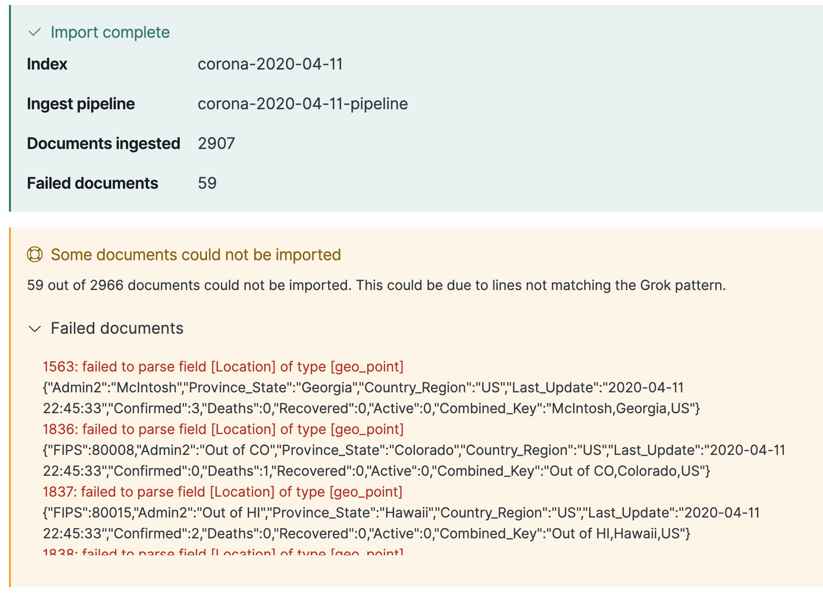
Well, let's look at the data file:

So, that is indeed a case of missing data in some of the records. The reason we're getting the error is because without values for "Lat" and "Long_", the resulting string is not a valid input for a geo_point field. There are ways to handle what happens on failure but this is outside our scope - since the records with the data were inserted as documents, we can proceed with what we have.
You can quickly enter Discover and see that you're seeing data for 11.4 alongside the data for the previous days. This is exactly because we've made the index "backwards compatible" to the index pattern created in the first post. Interestingly enough, if we hadn't done that we would still be able to see the document count in the graph, but not see of the any actual documents without using a separate index pattern.
OK, that's enough ingestion, let's get back to mapping.
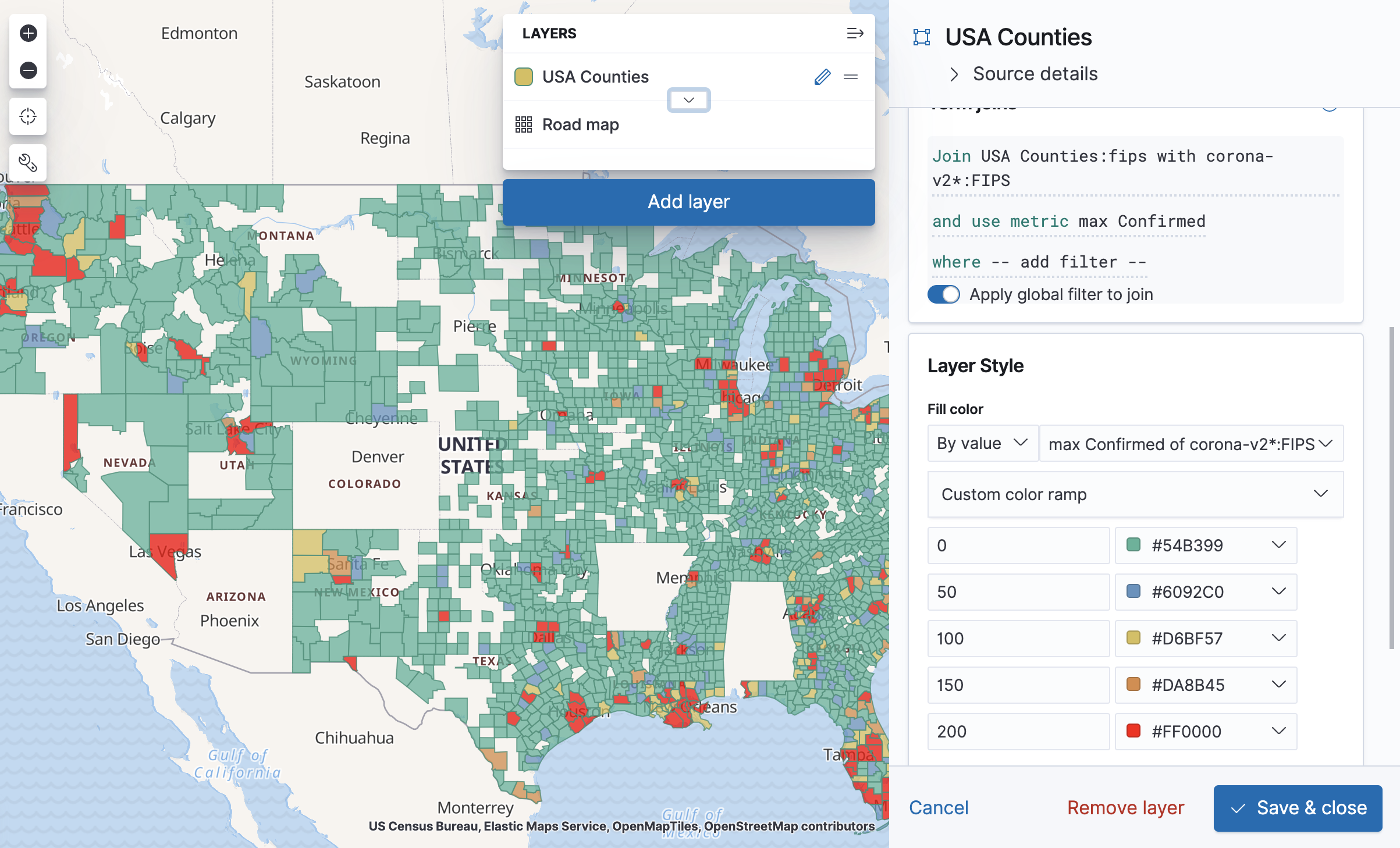
In the Maps application, first remember to adjust the time filter so that the latest data will be included in it. Then add a new layer, and choose "EMS Boundaries" as the layer type. Choose USA counties. This layer is a region-split layer of USA counties, and now all we have to do is join it with the FIPS field in our new index pattern. Before we get to that, a nice way to make sure both sides of our data use the same values in the join field is to open "Source Details" in the layer edit panel and click on "usa counties". You'll then get to see the layer data on Elastic's maps site, and you can specifically search for FIPS values from your data and see that they exist in the same format in the USA counties source.
Back to the "Edit layer" panel in our map, click on the plus sign near "Term Joins" and choose "FIPS 6-4 (US counties)" as the Left field. Under Right source, choose corona-v2*, and under Right field choose FIPS.
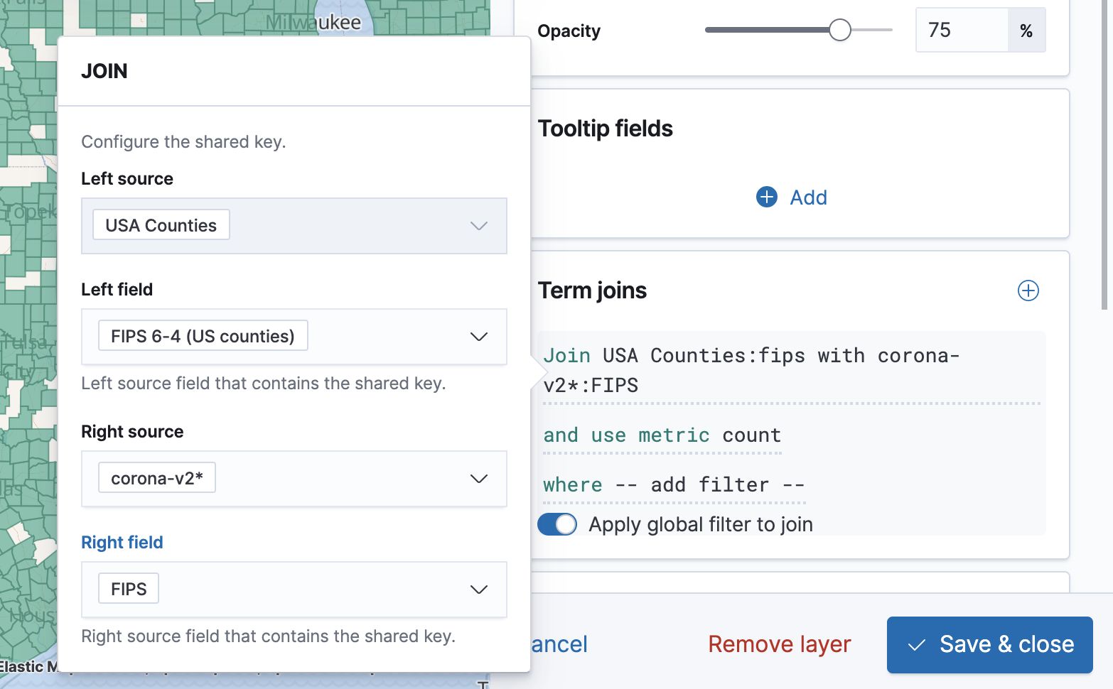
For "Use metric" we'll choose a max aggregation for "Confirmed".
The tooltip already shows us the values for each county, but what we want is to color them according to the metric. To do that, change the "Fill color" to "By value", choose "max Confirmed of ...", click the color ramp and choose "Custom color ramp". You can then configure each range by its initial value, so 0 would be a green county, 100 would be a yellow county, and so on. Of course this kind of visualization has a tendency to "lie" in the sense that what people perceive as "Green" may not be what the map maker thought of as "Green". Clicking on the Layer will show the map legend to help with that.
Next time, we'll look beyond Kibana and into automating our data load process.
Need help setting up Elasticsearch and Kibana for your use case? Reach out to us today!


Comments (1)
Elastic Maps looks great! Thanks for sharing!
Comments are now closed