
 Shai Greenberg
In this post we will cover the basics of working with Vega and show how it can help in pushing the boundaries of what's possible with Kibana. Specifically, we will create a bubble chart that's usable in Kibana Dashboards using Vega.
Our customers love Kibana. It's an excellent data visualization tool, no doubt, and a must-have tool for any Elasticsearch user. But it can also be very limiting if you are an advanced BI and dashboards user. We are often approached by customers who want to push the boundaries of Kibana and get some not trivial visualizations and dashboards made. One popular ask is creating visualizations that do not currently exist as part of the Kibana Dashboards app.
Although most of the visualization requirements are simple and can be met by the standard visualizations available in Kibana, a few aren't. A good example in this context is the inability of the standard visualizations to support Nested Aggregations. Another example is the lack of a Bubble Chart, which is a very common visualization in the BI world. (Canvas - another Kibana app - actually does offer a bubble chart, but has other limitations we'll get to in a future post.)
Vega in Kibana
Luckily for us, Kibana has built-in, first class support for Vega - a declarative format for creating, saving, and sharing visualization designs. With Vega, visualizations are described in JSON, and generate interactive views using either HTML5 Canvas or SVG.
Vega (or rather its variant used in Kibana, Vega-Lite) is a language for creating visualizations that is available for use within Kibana as a visualization type, and can be integrated into Kibana Dashboards. Since when using Vega you are given the opportunity of specifying the Elasticsearch query yourself, this solves the Nested Aggregation issue by allowing the user to define the base aggregation for the data. Vega's rich syntax allows creating many types of charts, including a Bubble Chart and of course pretty much anything else.
As Vega visualizations are not always simple to understand and define, we'll guide you in the process of building one, by first looking at the built-in Vega example in Kibana and modifying it to create a bubble chart. We won't be using a Nested Aggregation, but we'll briefly discuss the solution for that requirement as well. What you'll need in order to read on is to have some basic familiarity with Elasticsearch and Kibana.
Understanding the built-in Vega example
We'll start with a short overview of how the built-in example works, and modify it in the next section.
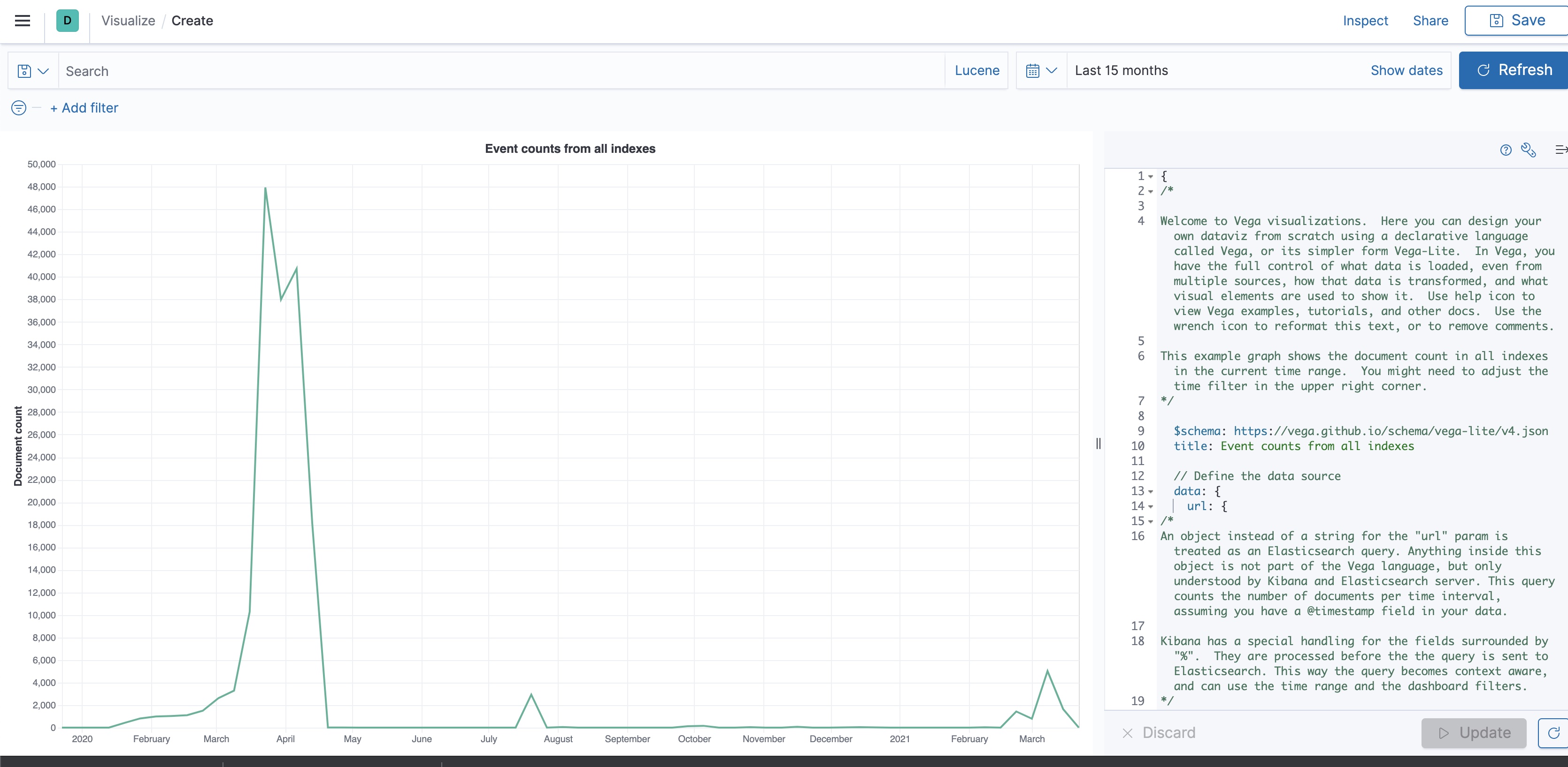
The Vega screen: On the left side of the screen we can see the visualization, while the right side shows the Vega syntax that created it. Above, we can see the time filter and the search bar, both of which can be used to filter the visualization whether we're viewing it directly or when it's part of a dashboard. We can see how this is done in the first part of the Vega syntax:
// Apply dashboard context filters when set
%context%: true
// Filter the time picker (upper right corner) with this field
%timefield%: @timestamp
The Elasticsearch Query: Within the second part of the Vega syntax, we can see the query that is used to get the data. That's a simple Elasticsearch syntax which you should already be familiar with, except of course for the placeholders used by Vega. This is a Date Histogram that uses our time filter. Since no metric is mentioned, the default document count metric is used.
// Which index to search
index: _all
// Aggregate data by the time field into time buckets, counting the number of documents in each bucket.
body: {
  aggs: {
    time_buckets: {
      date_histogram: {
        // Use date histogram aggregation on @timestamp field
        field: @timestamp
        // The interval value will depend on the daterange picker (true), or use an integer to set an approximate bucket count
        interval: {%autointerval%: true}
        // Make sure we get an entire range, even if it has no data
        extended_bounds: {
          // Use the current time range's start and end
          min: {%timefilter%: "min"}
          max: {%timefilter%: "max"}
        }
        // Use this for linear (e.g. line, area) graphs.  Without it, empty buckets will not show up
        min_doc_count: 0
      }
    }
  }
  // Speed up the response by only including aggregation results
  size: 0
}
The path within the output: Note the "format" property which is Vega's way to filter the path in the result and feed a specific subsection of the output into the visualization logic. This part of the example tells Vega to take its data out of "aggregations.time_buckets.buckets" part of the aggregation output.
format: {property: "aggregations.time_buckets.buckets"}The visualization details: Finally, we come to the syntax for the visual representation of the data, which tells Kibana to plot the data as a Line Chart of the count over the time period. While not hard to comprehend, expect to have to dig through documentation plus some trial and error to be able to bend this to your needs.
encoding: {
   x: {
     // The "key" value is the timestamp in milliseconds.  Use it for X axis.
     field: key
     type: temporal
     axis: {title: false} // Customize X axis format
   }
   y: {
     // The "doc_count" is the count per bucket.  Use it for Y axis.
     field: doc_count
     type: quantitative
     axis: {title: "Document count"}
   }
 }
Creating the Bubble Chart
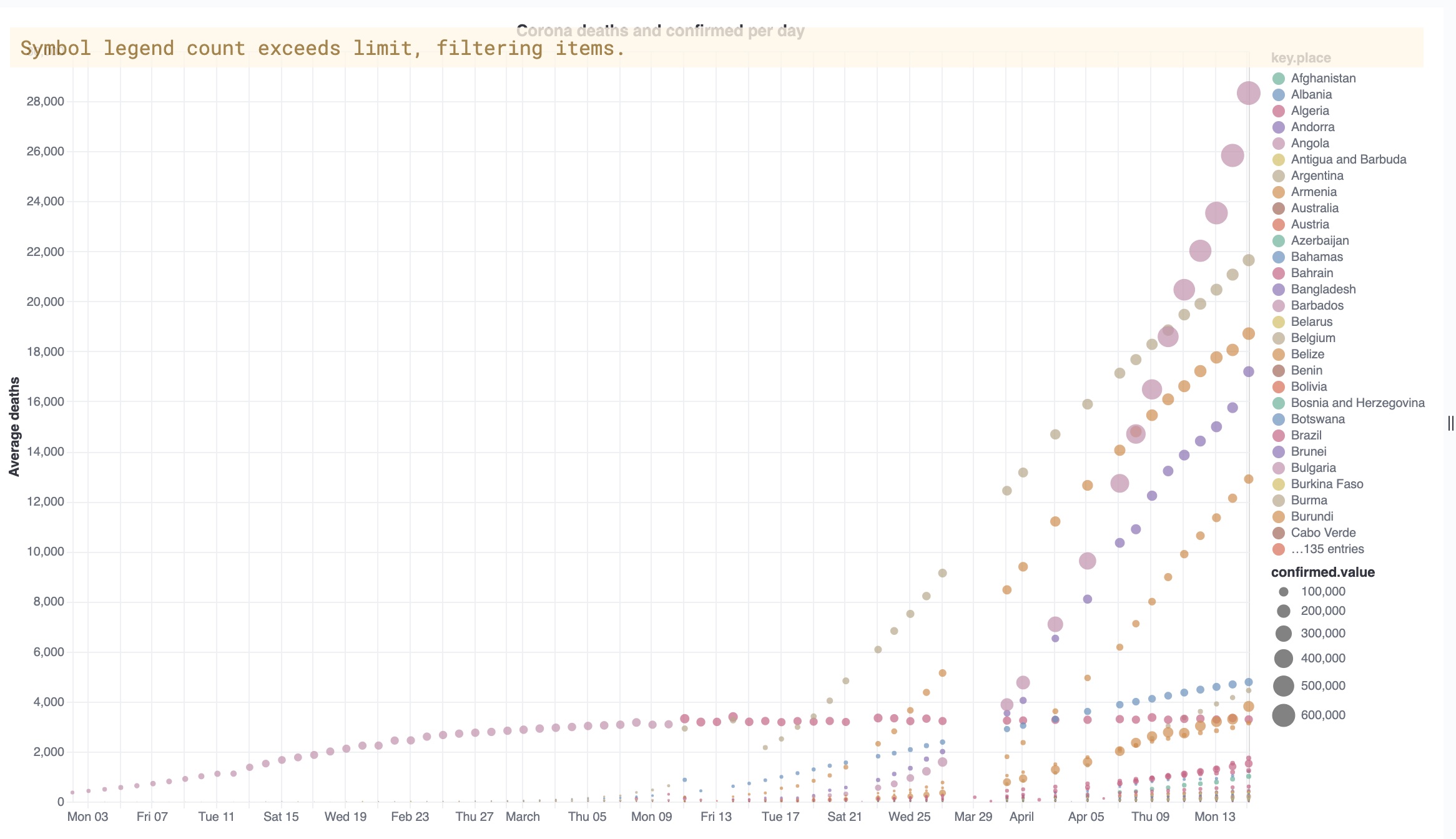
We'll now replace this syntax, part by part, with a syntax required to create the Bubble Chart. We'll use the Coronavirus data set created in the previous blog series, but the example should be clear enough so you could modify it to your use case.
Modifying the Elasticsearch Query: What we have is a time-based index, further divided into documents by keyword values (in this case - values of "Country/Region"). For each period - say, day - we want to plot a bubble per keyword value. The x-axis will represent the period, while the y-axis will represent a metric ("deaths"). This means the bubble will be placed at a point represented by the value of the metric for the specific period for the keyword value. The bubble will be sized by another metric ("confirmed"), and colored according to the keyword value.
Since Vega needs to have the results flattened rather than nested, we'll use a Composite Aggregation to achieve buckets that are variants of both the Date Histogram aggregation and Terms Aggregation on the keyword.
We'll also tell Elasticsearch to ignore buckets that have a zero value in one of the metrics - for that we'll use a Bucket Selector aggregation.
index: corona-v2-fb
      body: {
         "aggs": {
    "my_buckets": {
      "composite": {
        "size": 65535,
        "sources": [
          {
            "time_buckets": {
              "date_histogram": {
                "field": "Last_update",
                "interval": "day"
              }
            }
          },
          {
            "place": {
              "terms": {
                "field": "Country/Region"
              }
            }
          }
        ]
      },
      "aggs": {
        "deaths": {
          "sum": {
            "field": "Deaths"
          }
        },
        "confirmed": {
          "sum": {
            "field": "Confirmed"
          }
        },
        "filter": {
          "bucket_selector": {
            "buckets_path": {
              "deaths": "deaths.value"
            },
            "script": "params.deaths > 0"
          }
        }
      }
    }
  }
        size: 0
      }
    }
/*
If our source data had been nested data - for instance, if the data per country/region had been nested within a document that contains all the regions for a date, then we would've needed to wrap the aggregation in a Nested Aggregation, but the principle is identical.
Defining the path within the output: For format, we use the path according to the names used in our aggregation (for the nested case, an adjustment would've been needed for the extra nesting).
We can easily determine the correct value for this by running the aggregation directly against Elasticsearch and looking at the output:
{
  "took" : 95,
  "timed_out" : false,
  "_shards" : {
    "total" : 1,
    "successful" : 1,
    "skipped" : 0,
    "failed" : 0
  },
  "hits" : {
"total" : {
      "value" : 10000,
      "relation" : "gte"
    },
    "max_score" : null,
    "hits" : [ ]
  },
  "aggregations" : {
    "my_buckets" : {
      "after_key" : {
        "time_buckets" : 1586908800000,
        "place" : "Zimbabwe"
      },
      "buckets" : [
        {
          "key" : {
            "time_buckets" : 1585699200000,
            "place" : "Afghanistan"
          },
          "doc_count" : 1,
          "confirmed" : {
            "value" : 237.0
          },
          "deaths" : {
            "value" : 4.0
          }
So, we can see the path that contains the keyword we require - "place", the time value and the metric values, is at "aggregation.my_buckets.buckets", and therefore:
format: {property: "aggregations.my_buckets.buckets"}
}
Defining the visualization details for a Bubble Chart: We'll change the mark type to "circle" to allow the bubbles, and add a tooltip for better clarity. We'll use one of the metrics from the aggregation - "deaths" - as the y-axis metric. For the size we'll use the other metric - "confirmed". Finally we'll tell Vega to pick a color based on the keyword. Notice that the color scheme is decided according to the field type, as explained in the Vega-Lite reference.
mark: {"type": "circle", "tooltip": true}
encoding: {
x: {
  field: key.time_buckets
  type: temporal
  axis: {title: false}
}
y: {
  field: deaths.value
  type: quantitative
  axis: {title: "Deaths per day"}
}
"size": {"field": "confirmed.value", "type": "quantitative"},
color: {
      "field": "key.place",
      "type": "nominal"
      }
}
}
Testing and integrating the chart: After applying the changes, you should be able to see the results plotted in the chart. If you don't, make sure you've selected a period that has relevant data.
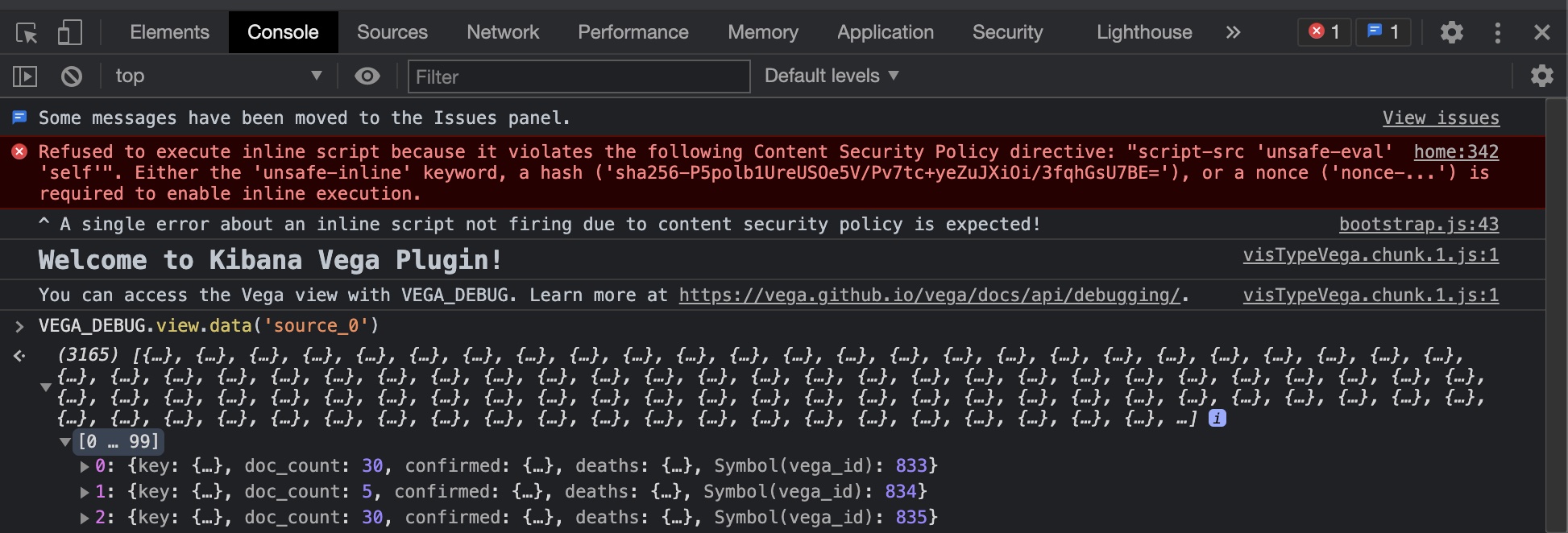
If something in the visualization strikes you as weird, you can see the data being used by the visualization by going to the browser dev console, and typing VEGA_DEBUG.view.data('source_0') in the console.
We can now save the visualization and incorporate it in any Kibana Dashboard.
In this post we've covered the basics of working with Vega, and showed how it can help in pushing the boundaries of what's possible with Kibana. Watch this space for more posts around that topic, and in particular we will soon discuss other options when choosing how to visualize Elasticsearch data and a discussion on when to pick which option.
If you have any visualization requirement based on Elasticsearch data you wish to discuss with us, feel free to contact us.


Comments are now closed